Ways to Boost Website Conversions with Psychology of Color
- Published in Web Design
- Permalink
When it comes to your website, you want every aspect to be perfect. You want to make sure that your site is easy to use, looks great, and converts as many visitors into customers as possible. One way to do this is by using the psychology of color. Studies have shown that different colors can evoke different emotions in people, influencing their behavior. We’ll discuss how you can use the psychology of color to boost your website’s conversion rate.
Making the right color choice to boost website conversions
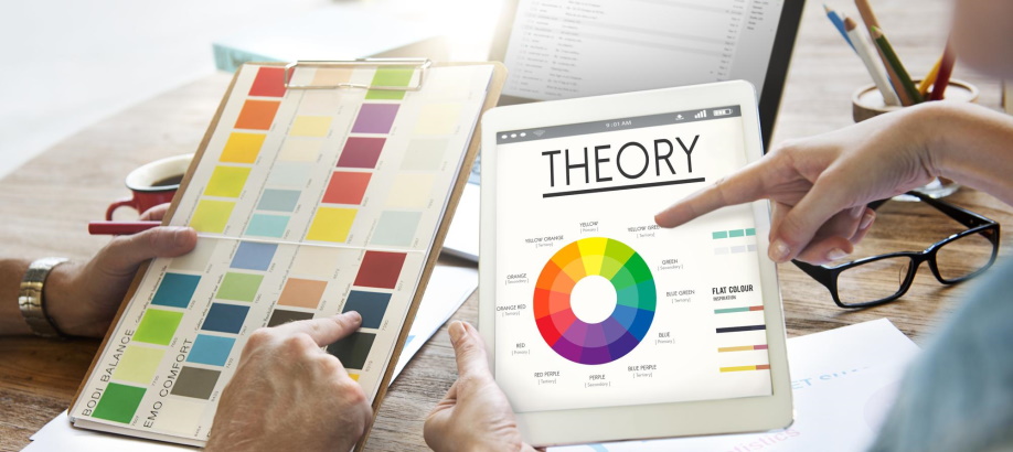
The color of your website has a deep impact on how readers feel, what they think, and whether or not they convert. So, is it time to change the colors on your site? As you look at revamping your website design, there are some important factors to consider. The psychology of color is more complicated than an article explains, but below are some basic guidelines to get you started.

To begin with, black is not typically a “converting” color. Instead, it can be seen as authoritative, serious, and even depressing. In some cases, it can work well for luxury brands or when you want to create a feeling of sophistication or exclusivity, but in most cases, it’s best to avoid black on your website.
White is often seen as a clean, safe and trustworthy color. In addition, it can convey a feeling of simplicity and neutrality. This makes it an excellent choice for websites that appear professional or scientific. However, too much white can be bland and uninviting, so it’s important to use other colors along with it.
Colors that increase sales on your website
Color is a powerful tool to use on your website. One study found that, for example, red increased the likelihood of someone purchasing a product by 80%. Next, we’ll examine other colors and how they affect sales.
What should you consider when choosing a color scheme for your site? Research has shown that different colors affect users: some make them less likely to buy while others increase their chances. To find out which ones work best for your site, read below!
Colors such as red and orange can make people feel hungry, while blues and greens can give off a more relaxing vibe. With this in mind, we’ve compiled a list of the top five best online marketing color schemes that will help increase sales on your website:
- Red and orange – These two complementary colors stimulate hunger and appetite, meaning they’re great for restaurants or food-related businesses. If these don’t resonate with your company’s values, try using brighter shades of one of those colors to create an energizing tone.
- Green and blue – Blue is known to soothe nerves, while green has tunes in a creative mood.
It has been proven that the colors you choose for your website can affect how customers feel about your brand and boost sales. You may think it’s crazy to worry about something as small as a color scheme on your site when there are many other things to consider. But maybe this is one of those cases where less is more. A few tweaks here and there could mean all the difference between success and failure.
The most important rule of thumb is to use high contrast colors – these are colors that have strong differences between their hues (color shades). For example, light blue mixed with dark red or green mixed with orange will create an uneasy feeling because they don’t complement each other well.